
Air Check Case Study: TLDR
Air Check is a free drive-through tire inspection offered at every store location, with over 15 million services completed annually. The program drives tire sales while strengthening customer trust through a safety-first experience.
Despite its success, the experience created friction for both customers and employees. Associates manually collected customer information, data accuracy was inconsistent, and customers lacked self-service tools like pre-check-in and service history access.
I led the end-to-end Discovery phase, partnering with UX Research to conduct in-store contextual inquiries, synthesize insights, and deliver the final Discovery report. I also supported the Proof of Concept phase as the team piloted a QR code self-check-in experience across nine stores.
Team: Erica Parra (Asst. UXR Manager), Stephanie McNicol (Principal UX Designer), Josh Surridge (Product Specialist), Carolina Lagarda (Senior UX Designer), Maritza Gonzalez (Senior UX Designer), Greg Vagen (IBM UX Design Contractor)
Our interim solution can be viewed below in the Air Check training video. I created the shot list, directed, and edited the video based on a script provided to me.
Phase 1: Discovery
Before designing solutions, we needed to understand why a service this successful still had so much untapped potential. The experience faced challenges on multiple fronts, including inconsistent data capture, unclear wayfinding, overwhelmed employees during peak hours, and post-visit communications that failed to resonate with customers. Our goal was to identify the root pain points across both the customer and employee experience.
Research Approach
Over six weeks I partnered with UX Research to run a mix method approach to gather data:
In-store observations and contextual inquiries at three store locations (Goodyear, Scottsdale, and Phoenix, AZ), watching the lane in real time and speaking with employees and customers during service
Employee interviews across four regions, exploring how demand, store layout, and best practice adherence varied
Customer diary study with 11 participants across the country, capturing the experience from awareness through post-visit follow-up
Competitive analysis of queue management and demand visualization from brands like Dutch Bros, Chick-fil-A, Jiffy Lube, and HonorHealth
Service blueprinting and customer journey mapping to connect the front-stage customer experience to back-stage operations
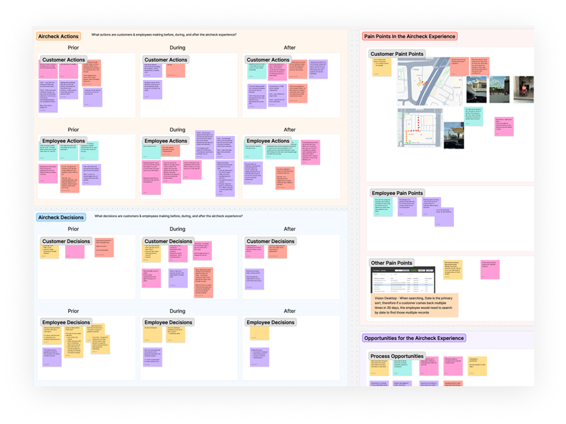
After fieldwork wrapped, I led synthesis across all research streams, identifying patterns and prioritizing opportunity areas. That synthesis became the foundation of the Discovery report I produced for executive review.
Key Findings
The research surfaced consistent themes across customer and employee perspectives:
Awareness and findability
“You know, I’ve never been a customer of Discount Tire up until this point. So I do appreciate that this service is available. And it’s something that I actually didn’t know necessarily existed. So I think overall, it was a very, very good experience.”
9 out of 12 customers went to Google Maps first when looking for a free tire pressure check, but the store listings did not show Air Check as an available service
Many customers assumed the service existed but lacked confidence from the digital experience — some called ahead to confirm
There was no dedicated landing page or SEO strategy for Air Check, meaning customers were finding the service through assumption, not design
In-lane experience
Wayfinding varied significantly by store — stores weren’t originally built with an air check lane in mind, and signage was inconsistent
Employees were capturing customer email and phone numbers manually using hand-held devices, but only about 45% of email addresses were being captured, and data accuracy was a recurring issue
Seasonal and weather-driven demand spikes created real pressure on the lane, but there was no predictive scheduling or real-time queue visibility for employees
The average aircheck took around 4 minutes 18 seconds, with roughly 36 seconds of that spent just collecting customer information — a clear target for efficiency gains
Post-visit communications
About half of diary study participants did not receive the post-visit takeaway email, despite having visited stores before
Customers who did receive the takeaway found it valuable: 89% rated it as very useful, and 80% were likely to act on the info via the link
SMS opt-in rates were extremely low (2–3%), partly because the opt-in moment came too late in the flow
Customers wanted personalized tire recommendations, pricing guidance, and easier appointment booking — not just a report of their current tire status
Employee perspective
Employees across high- and low-volume stores described very different realities: some ran 80+ airchecks a day, others around 20
The best-performing stores had shifted their mindset from “checking air” to “safety inspection” — and that framing made a measurable difference in how employees communicated with customers
The hand-held devices used to scan tread depth and collect customer info were only being used in about 68% of Airchecks nationally, representing a significant gap in data capture
Deliverables
At the end of the Discovery phase I produced:
The Discovery Report: a comprehensive synthesis of findings organized around three opportunity areas — Awareness, In-Lane Service, and Post-Visit
A Future-State Experience Narrative: a scenario walkthrough showing how an improved, connected Aircheck experience would feel for both customers and employees, used to align the executive team on direction
Customer Journey Map and Service Blueprint: mapping touchpoints, pain points, and back-stage dependencies across the full Aircheck lifecycle
Competitive Analysis: benchmarking queue management and demand visualization patterns from adjacent industries to inspire the solution space
Divide and Conquer
I organized the Design Team into multiple workstreams so we could address several opportunities identified in the report simultaneously. I had my two senior designers focused on improving the Air Check web experience, while key insights were shared with the SEO Team to support awareness efforts and with the Customer Insights Team to refine customer communications. I partnered my IBM contractor with the Store Experience Team to explore future-state integration concepts on the hand-held device, while I supported the Aircheck pilot POC and oversaw the broader design strategy across all tracks of work.
Phase 2: Proof of Concept
The Hypothesis
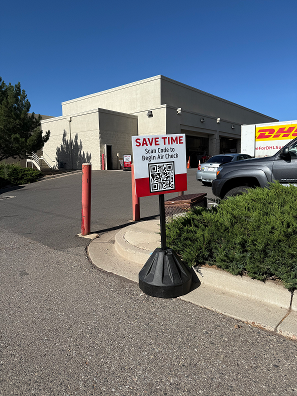
One of the clearest opportunities from Discovery was the 36 seconds spent manually collecting customer information at the lane. The team hypothesized that a QR code sign placed at the aircheck queue entrance could let customers self-submit their details before reaching the employee which could reduce friction, improve data accuracy, and free employees to focus on the inspection itself.
In the POC phase, my role shifted to UX support as the team designed and ran the test. I contributed to the customer-facing experience and helped shape how we measured success.
How the POC worked
The team placed weighted bollard signs with printed QR codes at the aircheck lane entrance across ten store locations (one pilot store plus nine test stores in Washington, Texas, and Arizona). Customers who scanned the code were taken to a short Alchemer form to submit their name, contact details, and vehicle information before reaching the employee.
Stores were selected to represent a range of demand levels, lane layouts, and regional contexts. Each store received up to three signs depending on their queue setup. Store managers participated in a 30-minute kickoff call and a mid-pilot check-in, and store-level metrics were tracked weekly throughout the two-week test window.
The team placed weighted bollard signs with printed QR codes at the aircheck lane entrance across ten store locations (one pilot store plus nine test stores in Washington, Texas, and Arizona). Customers who scanned the code were taken to a short Alchemer form to submit their name, contact details, and vehicle information before reaching the employee.
Stores were selected to represent a range of demand levels, lane layouts, and regional contexts. Each store received up to three signs depending on their queue setup. Store managers participated in a 30-minute kickoff call and a mid-pilot check-in, and store-level metrics were tracked weekly throughout the two-week test window.
Results
Results varied by store, with adoption strongly correlated to demand level and how consistently employees encouraged customers to scan. Two stores stood out:
“The biggest takeaway and benefit — it needed a little bit of a coachable moment with some of my people doing their checks, but was the understanding that they take that information and verify what we had. We found that we had a lot of inaccurate data on our VTV devices.”
At the highest-performing location, email capture increased by 26 percentage points and the rate of bad email inputs dropped by 34 percentage points over the two-week period
Mileage capture (a key data point for service recommendations) increased by up to 17 percentage points at another top store
Cumulative QR code adoption across all POC locations reached 36% measured against Zebra scans, and 27% against total Haltec inflations — meaningful for a cold-start test with no digital promotion
Qualitative feedback from employees and customers was broadly positive. Employees noted the potential for efficiency gains in a fully integrated solution, and customers responded better to messaging framed around time savings than around data collection.
What we learned
Store demand was the biggest predictor of adoption — high-volume stores saw higher scan rates, likely because the wait time made the QR code feel worthwhile to customers
Android users experienced slower QR code load times than iOS users, pointing to a UX consideration for a future integrated solution
Returning customers needed a different entry path — within the 2-week time frame about 20% of Aircheck customers were repeat visitors, and the form wasn’t optimized for them
The form confirmation screen turned out to be useful in an unexpected way: employees could use it to verify and correct customer data on the spot
The “Save Time” CTA was more motivating to customers than messaging about data collection — an important framing insight for any future rollout
Outcomes & Next Steps
The Discovery report and POC results together built the business case for a fully integrated QR code solution within the hand-held device. That integration would allow customers to check in digitally, have their vehicle data pre-populated, and be added to the queue before they even reach the lane.
The experience, if released to all of Discount Tire’s 1200+ stores, is projected to return $10M–$23M in incremental revenue
The cost-to-serve a customer goes from $1.80 per vehicle to $1.64 per vehicle with a projected adoption of 60% of all customers.
Beyond the tactical outcome, this project reinforced how much design can accomplish by working across the customer journey rather than optimizing a single moment. The Discovery phase showed that the most impactful changes weren’t necessarily in the lane itself.
Reflection
Leading Discovery on a service this operationally complex was a real challenge — and one of the things I found most valuable was the fieldwork. Being in the stores, watching how employees navigated a busy lane while also trying to collect data and build rapport with customers, made abstract problems concrete in a way that desk research never could.
The synthesis phase pushed me to hold a lot of complexity at once: customer research, employee interviews, a diary study, a competitive analysis, and existing quantitative data. Organizing that into a clear, actionable report for an executive audience was the part I’m most proud of on this project.
If I were to do anything differently, I’d invest more time early in building a shared mental model with the cross-functional team around what “success” looked like before synthesis began. The goals were clear, but the criteria for prioritizing opportunities versus parking them for later weren’t always aligned — and that created some friction during the handoff to the POC phase.